

Website Redesign
User Research, Interaction Design, Layout, Mobile, Tablet, Desktop
From this 🚫

To This ✅
Project Overview
MeatEater’s flagship content site was in need of a design overhaul. It was my job as UX Design Lead to identify opportunities and pain points. I began with user personas and a site analysis to identify and prioritize next moves. The result was a fully redesigned website with increased engagement, conversion, and improved navigation, in addition to many other positive impacts.
My role: User Experience Design Lead
Tools used: Figma, Google Analytics, Heatmaps
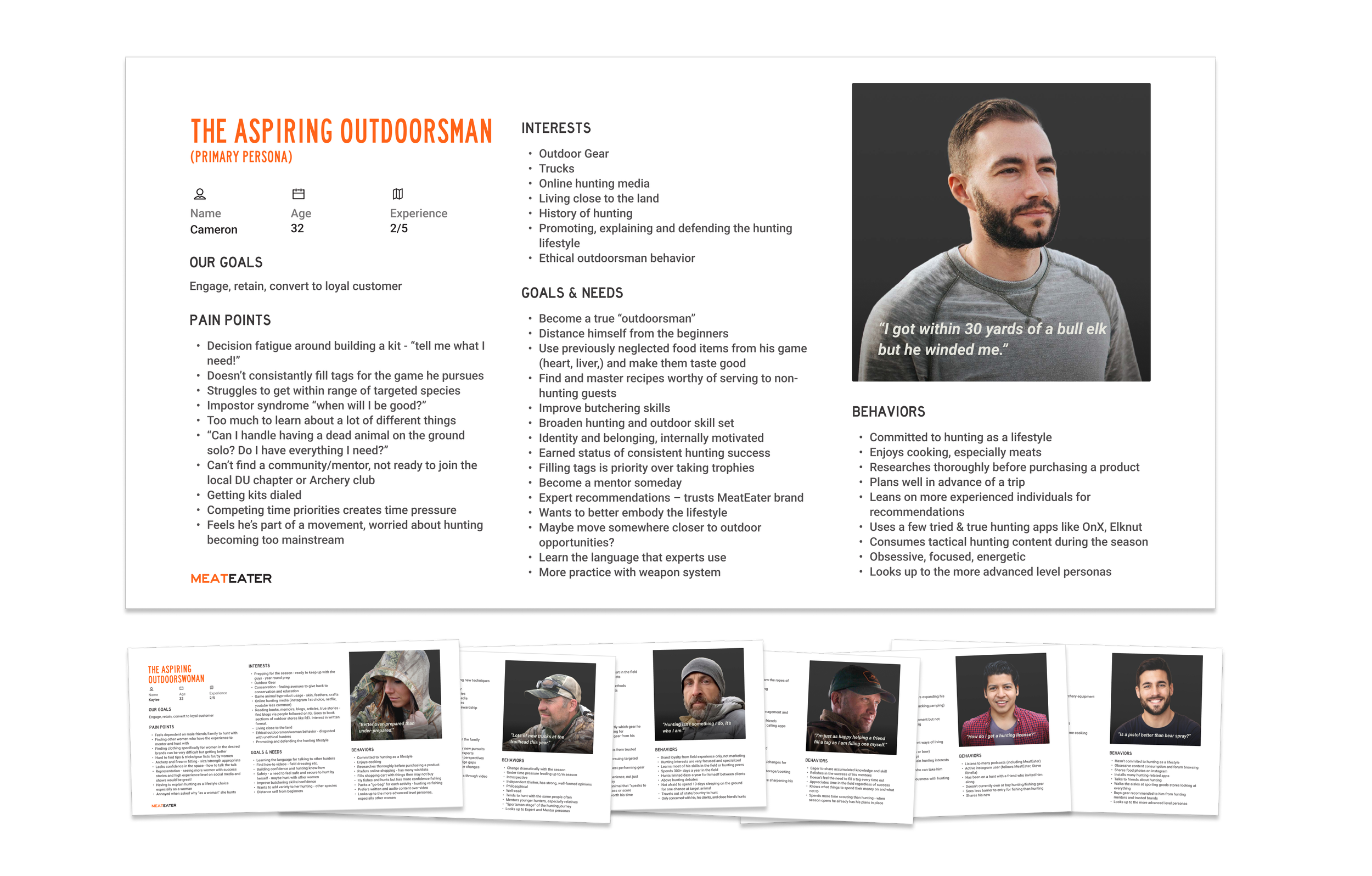
Target Audience/User
By combing through site analytics data and collaborating cross-disciplinarily, we were able to put together an accurate picture of who our users were and who are primary persona was.
Opportunity
The site’s home page was lacking usability, mobile optimization, and overall visual appeal; Our content was not being showcased effectively.
Goals
Encourage exploration of content and keep users engaged longer.
Highlight video content and give it priority over editorial content.
Elevate the presence of the MeatEater Crew on homepage.
Process
UX Audit
Personas
Design brief
Design explorations
Prototyping
Heat maps
A/B testing
Created design system
Research Insights
Our users are 70% mobile
Our users are more likely to convert when viewing video content
Our users rely heavily on search to navigate
Our users have a strong connection with at lest one member of the MeatEater crew and want to buy what they use
How Might We? (WMW?)
Optimize our mobile user experience to encourage exploration and ultimately, conversion?
Increase conversion by highlighting video content?
Elevate search and improve site navigation?
Highlight members of the crew and their gear to increase conversion?
Key Design Solutions
Navigation Redesign
Desktop
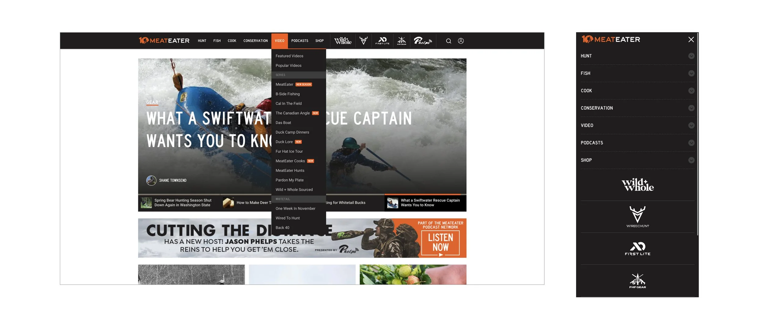
From this 🚫

To This ✅
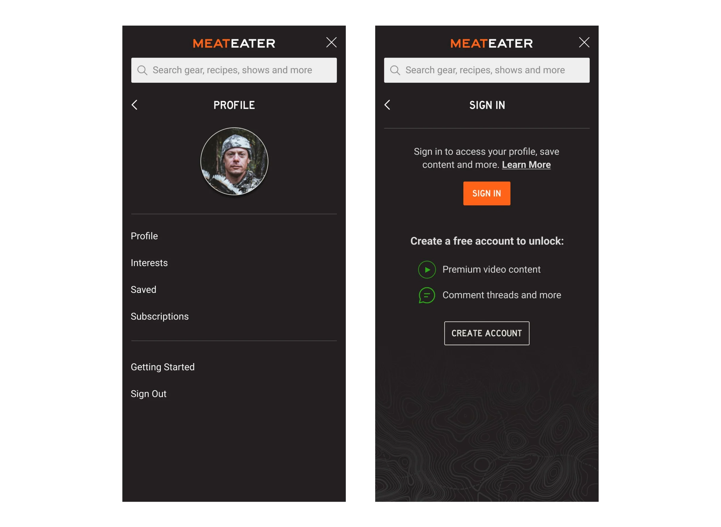
New Sign In and User Profile Experience
Desktop, iPad, iPhone
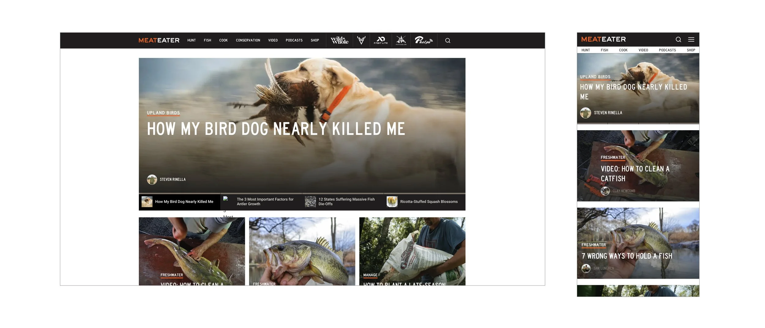
Home Page Redesign
Desktop, iPad, iPhone

Results
✅ Metrics
Bounce Rate: Improved (Decreased) 14.5%
Engaged Sessions: +4.7%
Homepage Content Clicks: +2%
Subheader Clicks: +15.4%
Gear Clicks +30.8%
✅ Improved Navigation
Transitioned from underperforming dropdown list navigation to industry best practice mega menus. Used imagery and grouping to increase visual scanning and boost user engagement
✅ More Engaging Homepage
Drove increased engagement, sessions time and clicks to commerce by making the home page more video centric and adding top article comment sections into the home page.
✅ Increased Click-Through on Products
Increased product tile click through on the homepage be streamlining them and eliminating unnecessary descriptive text.
✅ Increased Advertisement Presence
Redesigned many pages of the website to elegantly feature relevant advertisements which drive revenue.